What it is for#
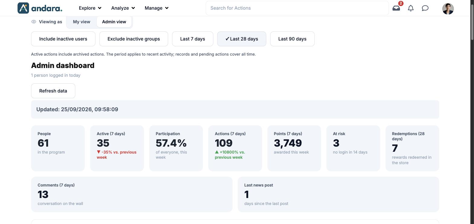
This is the dashboard you see on the app's home page when you switch to the admin view. From top to bottom it answers three questions: how the programme is going, what has got stuck and who needs a call. Almost every figure can be clicked to see the people behind it, copy their emails, download them or send them a notification.
Where it is: on the home page (Home), in the Viewing as switch, Admin view tab. The other tab, My view, is the home page any person sees.
What you see#
| Element | What it shows |
|---|---|
| Viewing as | Switches between My view (your participant home page) and Admin view (this dashboard). |
| Include inactive users, Exclude inactive groups, Last 7/28/90 days | The same toggles as the follow-up panels (see Filters). |
| Admin dashboard | The title, with how many people signed in today. |
| Refresh data | Loads or reloads the dashboard. If it says it is preparing the dashboard and does not move on, click it. Underneath, the time of the last update. |
| Headline metrics | Nine cards: People, Active (7 days), Participation, Actions (7 days), Points (7 days), At risk, Redemptions (28 days), Comments (7 days) and Last news post. |
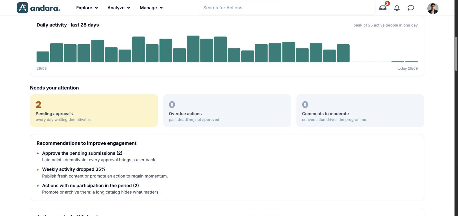
| Daily activity · last 28 days | Bars with the active people each day and the peak in one day. |
| Needs your attention | Pending approvals, Overdue actions and Comments to moderate. The one with work to do is highlighted. |
| Recommendations to improve engagement | Sentences derived from the data, each with a coloured dot by urgency. |
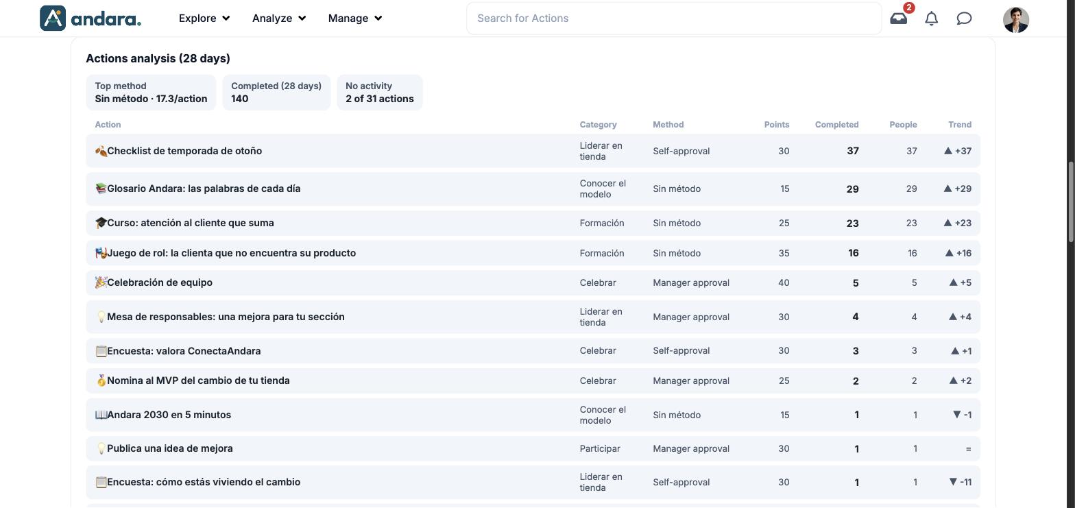
| Actions analysis (28 days) | Three summaries and the actions table. |
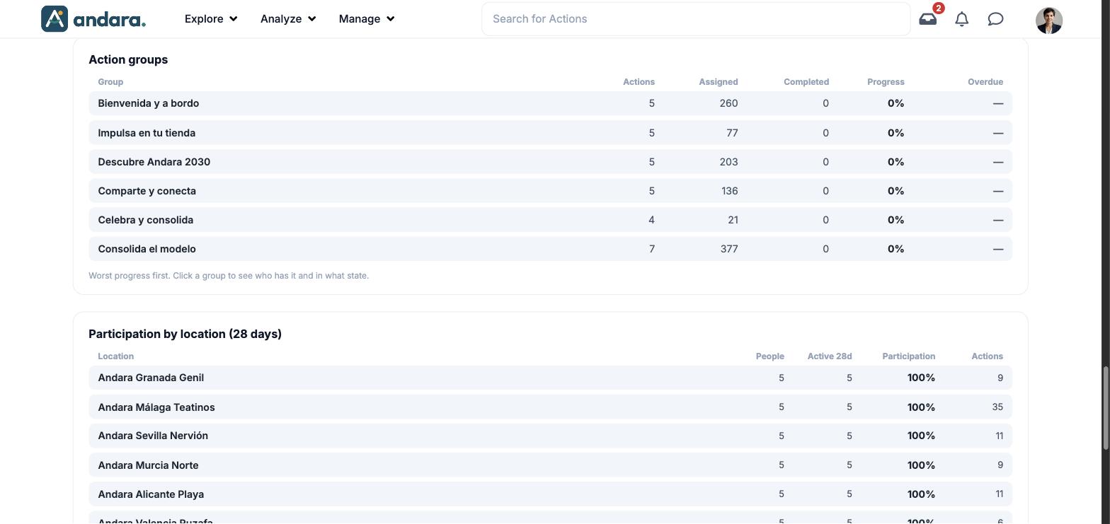
| Action groups | One row per group, worst progress first. Click a group to see who has it and in what state. |
| Participation by location (28 days) | One row per workplace, with the average participation in the footer. |
Metrics#
| Metric | What it measures | How it is calculated |
|---|---|---|
| People | The programme's headcount. | People in the programme. |
| Active (7 days) | How many people did something this week. | People active in the last 7 days, with the change against the previous week. |
| Participation | What share of the headcount is active. | Active over everyone, this week. |
| Actions (7 days) | Challenges completed in the week. | Number of actions, with the change against the previous week. |
| Points (7 days) | Points awarded in the week. | Sum of points. |
| At risk | Who is dropping off. | People with no login in 14 days. |
| Redemptions (28 days) | Store activity. | Rewards redeemed in the store in 28 days. |
| Comments (7 days) | The week's conversation. | Comments on the wall. |
| Last news post | How long since you last posted. | Days since the last post. |
| Daily activity | The shape of the curve: whether the programme is rising, holding or fading. | Active people per day, from 28 days ago to today. |
| Pending approvals | Hand-ins waiting for sign-off. | Number of actions. |
| Overdue actions | Challenges past their deadline. | Actions past deadline and not approved. |
| Comments to moderate | Held messages. | Number of comments in the moderation queue. |
| Top method | The completion method used most. | The method and completions per action. |
| Completed (28 days) | Volume of actions done. | Number of actions completed in 28 days. |
| No activity | Actions nobody touches. | Actions with no completion in the period, over the total. |
| Actions table | Where progress comes from. | Per action: Category, Method, Points, Completed, People and Trend (difference against the previous period). |
| Action groups | Which block of the journey people get stuck in. | Per group: Actions, Assigned, Completed, Progress and Overdue. |
| Participation by location | The difference between workplaces. | Per workplace: People, Active 28d, Participation and Actions. Active = signed in within the last 28 days, as the footer says. |
The list behind a figure#
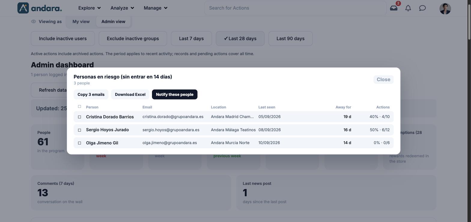
Clicking a card or a row opens a window with the people behind it. For At risk, for example, it shows Person, Email, Location, Last seen, Away for and Actions (each person's progress), and a checkbox per row to pick people. At the top it has three buttons:
| Button | What it does |
|---|---|
| Copy N emails | Copies the emails in the list (or in the checked rows). |
| Download Excel | Downloads the list. |
| Notify these people | Opens the notification form (see below). |
Notifying a list#
| Field | What it does | Values |
|---|---|---|
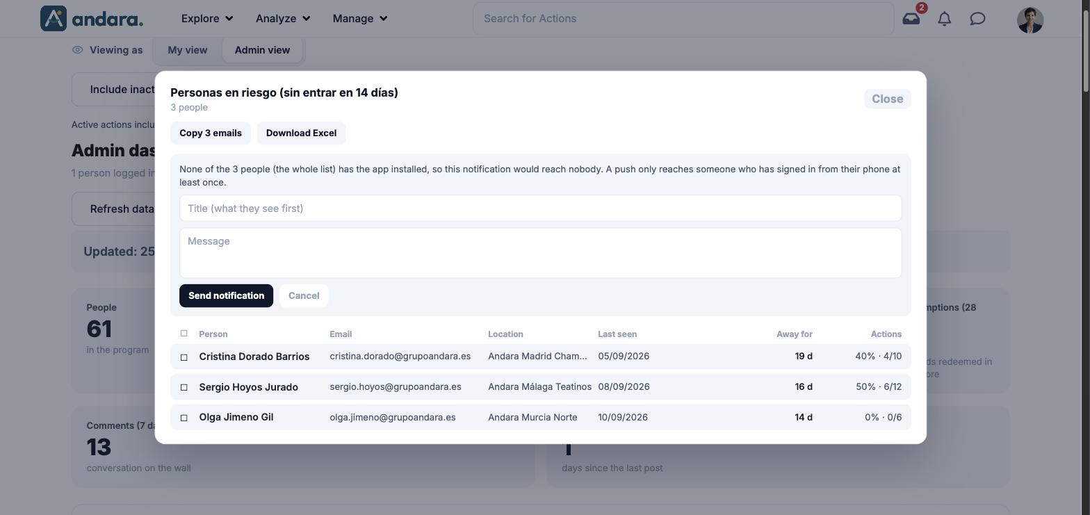
| Reach message | Before you write anything, it tells you how many people on the list it would reach: a push only reaches someone who has signed in from their phone at least once. | Information text. |
| Title (what they see first) | The notification headline. | Text. |
| Message | The notification body. | Text. |
| Send notification | Sends the notification to the people on the list who can receive it. | Button. |
| Cancel | Closes the form without sending anything. | Button. |
Filters#
| Filter | What it does | Values |
|---|---|---|
| Include inactive users | Counts people who can no longer sign in. | Toggle. Default: off. |
| Exclude inactive groups | Leaves out the actions of deactivated action groups. | Toggle. Default: off. |
| Last 7 days / 28 days / 90 days | The window for recent activity. Records and pending actions cover all time. | Default: Last 28 days. |
| List checkboxes | Inside the detail window, they limit copying, downloading and notifying to the checked rows. | One per row, and one in the header for all. |
Each metric carries its window in its title (7 days, 28 days or none): the toggles do not change them.
How to#
Notify people who are dropping off#
- 1
Open the figure
Click the At risk card.
- 2
Pick people if needed
Keep the whole list or check only some people.
- 3
Prepare the notification
Click Notify these people and read the reach message: it tells you how many people it will reach.
- 4
Write and send
Fill in Title (what they see first) and Message and click Send notification. If you do not want to send it, Cancel.
Find the workplace that is falling behind#
- 1
Go down to Participation by location
Compare each workplace's Participation with the average in the footer.
- 2
Open the workplace
Click its row to see its people and act from the list.
Things to know#
A sent notification cannot be withdrawn. Read the reach message first: if nobody on the list has the app on their phone, the notification reaches nobody.
- The metrics use different windows (7 days, 28 days, none). Do not add up figures from different windows.
- The data is calculated when the dashboard loads. If you have just approved hand-ins, click Refresh data.
- A column with the same value on every row is a fault, not data. In the project used for the screenshots, Action groups shows 0 completed and 0 % progress for every group while Aggregated Action Progress shows up to 100 %: if you see this, do not decide based on that table.
Related#
- Engagement dashboard: how to read this dashboard and what to do with each list.
- Smart recommendations.
- Aggregated Action Progress and Comments Dashboard.