What it is for#
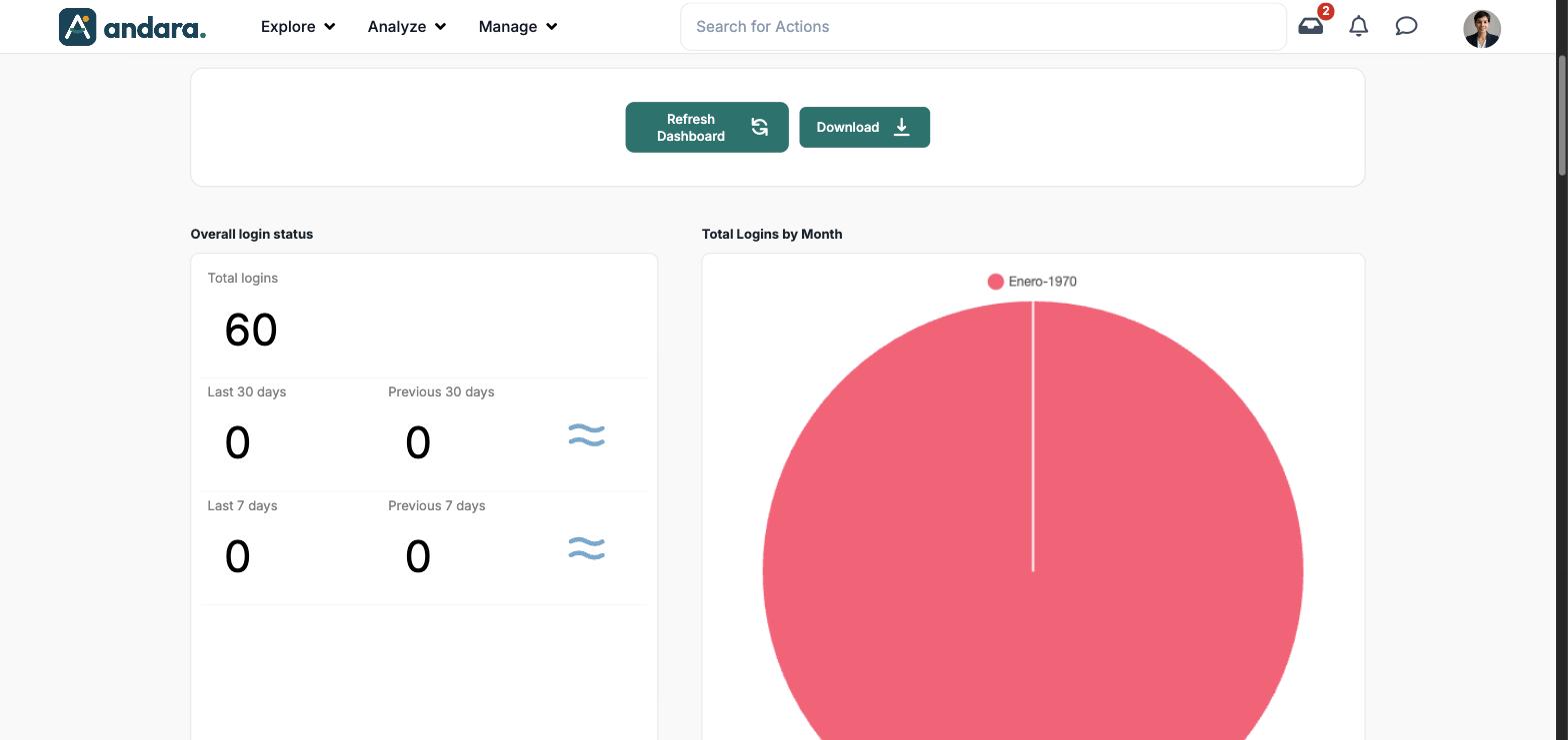
This screen counts sign-ins to the app: how many in total, how many in the last 30 and 7 days compared with the previous period, and how they split by month, tribe and location. Use it to see whether people keep signing in and which groups or workplaces have gone quiet.
The screen starts empty: it fills in when you click Refresh Dashboard.
Where it is: Analyze › Login Dashboard.
What you see#
| Element | What it shows |
|---|---|
| Refresh Dashboard | Loads the data. It takes a few seconds. |
| Download | Downloads the data as a spreadsheet file. |
| Overall login status | The headline figures (see Metrics). |
| Total Logins by Month | Pie chart with sign-ins split by month. |
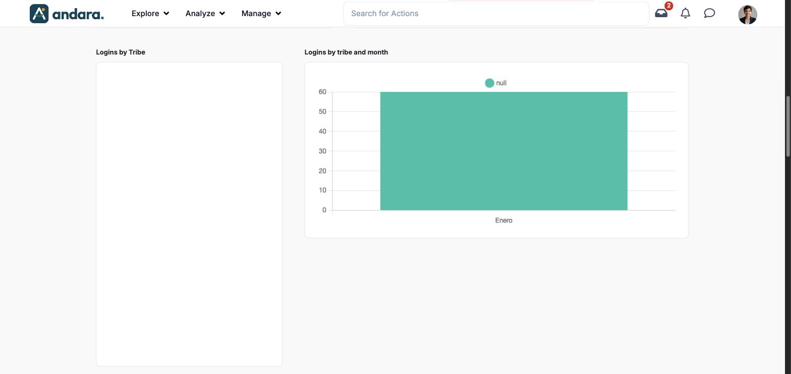
| Logins by Tribe | Sign-ins split between tribes. |
| Logins by tribe and month | Bar chart per month, with one series per tribe. |
| Logins by Location | Sign-ins split between workplaces. |
| Logins by Location and Month | Bar chart per month, with one series per workplace. |
| Logins by month per location | Each month's sign-ins, workplace by workplace. |
Metrics#
| Metric | What it measures | How it is calculated |
|---|---|---|
| Total logins | All recorded sign-ins. | Number of sign-ins. |
| Last 30 days / Previous 30 days | Last month's sign-ins against the month before. | Number of sign-ins in each window. The icon on the right shows whether it goes up, down or stays level (≈). |
| Last 7 days / Previous 7 days | The same, over a week. | Same as above. |
| Total Logins by Month | Which months concentrate the use. | Each month's sign-ins over the total. |
| Logins by Tribe and by tribe and month | Which groups sign in most. | Sign-ins by the people in each tribe, in total and per month. |
| Logins by Location, by Location and Month and by month per location | Which workplaces sign in most. | Sign-ins by the people in each workplace, in total and per month. |
Filters#
The screen has no filters: it always shows the whole project.
How to#
Check whether use is dropping#
- 1
Load the data
Click Refresh Dashboard and wait for the figures to fill in.
- 2
Compare windows
In Overall login status, compare Last 30 days with Previous 30 days, and the same over 7 days.
- 3
Find where
Go down to the tribe and location charts to see which group or workplace explains the drop.
Things to know#
- The screen starts empty. If everything is zero, you most likely still need to click Refresh Dashboard.
- In the project used for the screenshots the data does not split properly: every sign-in falls in "Enero-1970", tribes show as "null", the location breakdowns stay blank and the last 30 days show 0 even though people sign in. If you see the same, the screen's figures are not reliable: recent participation is better read in the Pulse Check Dashboard or the Admin view.
- To know who has signed in and who has not, person by person, use Signons & Attempted Signons.
Related#
- Signons & Attempted Signons: the record of each sign-in.
- Users Detail Report and Detailed Action Progress.
- Analytics and reports.