What it is for#
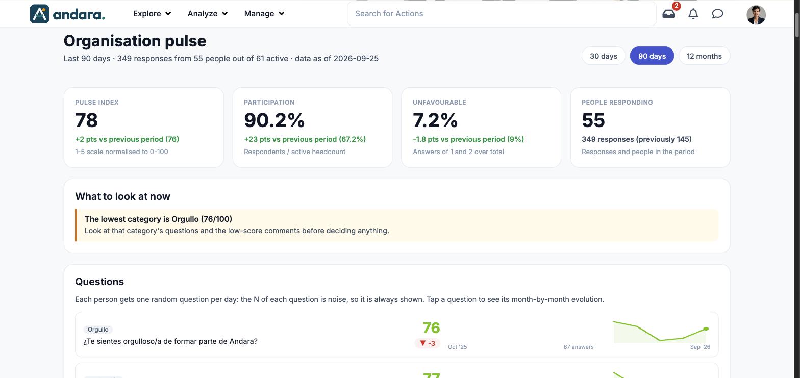
This screen reads the answers to the pulse questions, the random question each person gets every day. It tells you how people are feeling (the index), how many of them answer and where the low answers are, and compares it with the previous period.
The screen is titled Organisation pulse. Below the four headline figures it breaks the results down by question, category, location and area, and ends with the comments people left.
Where it is: Analyze › Pulse Check Dashboard.
What you see#
| Element | What it shows |
|---|---|
| Subtitle | The period, how many responses there are, from how many people out of how many active, and the date of the data. |
| 30 days, 90 days, 12 months | The period you are looking at. The selected one is highlighted. |
| Cards | Pulse index, Participation, Unfavourable and People responding (see Metrics). |
| What to look at now | Readings derived from the period's data, for example which category is lowest and what to check before deciding. |
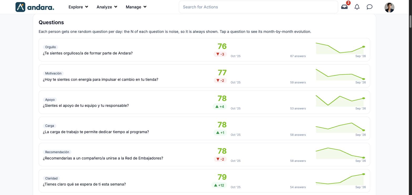
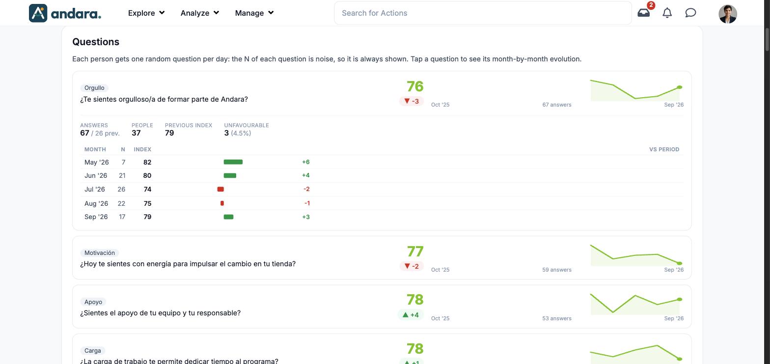
| Questions | One row per question with its category, index, change and a trend line. Click one to see its month-by-month detail. |
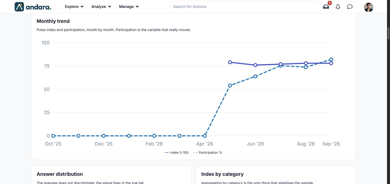
| Monthly trend | Line chart with each month's index and participation. |
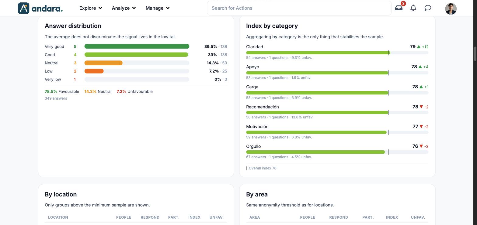
| Answer distribution | How answers spread across the five values of the scale. |
| Index by category | Each category's index and its change. |
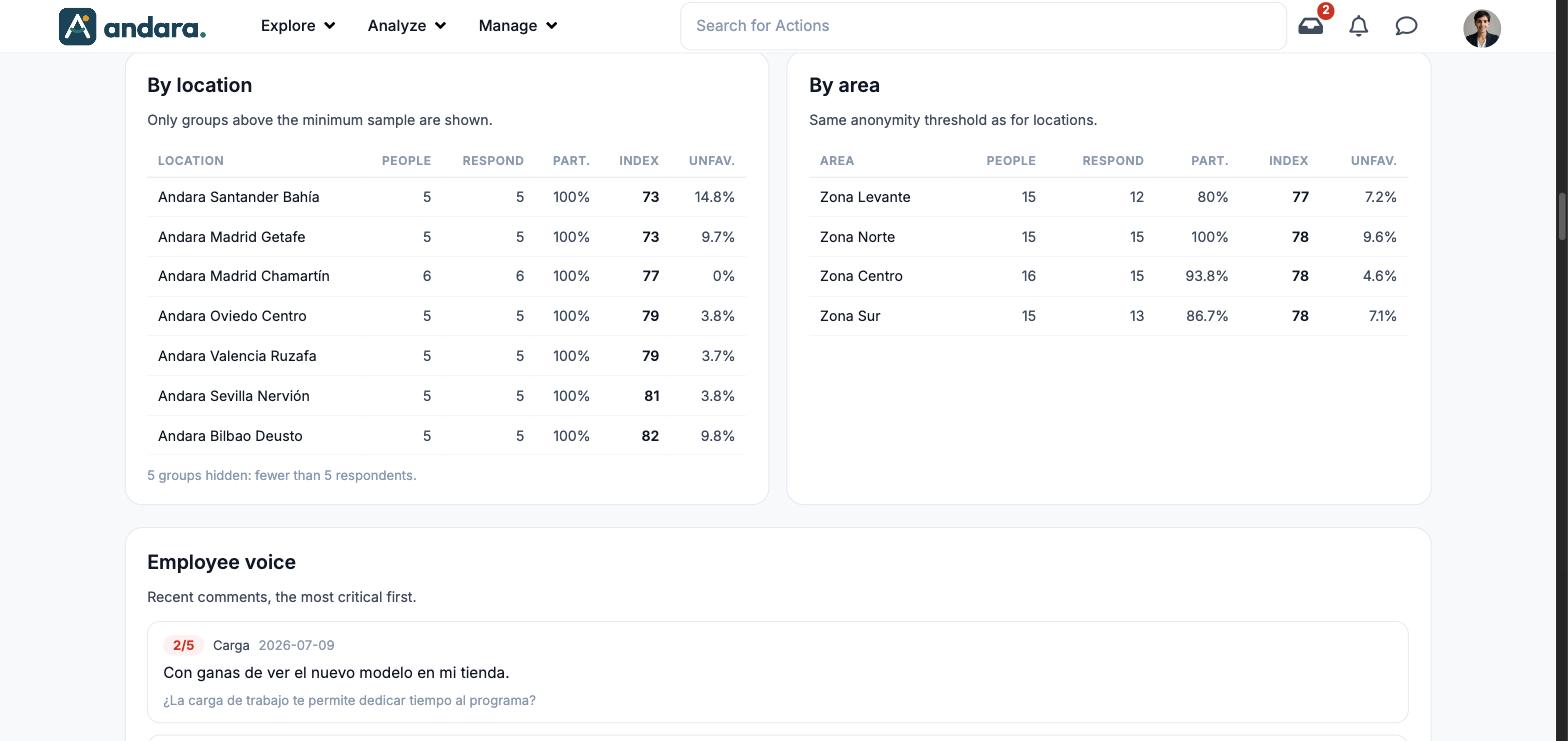
| By location and By area | Tables with the result per workplace and per unit of the structure. |
| Employee voice | Recent comments, the most critical first. |
Metrics#
| Metric | What it measures | How it is calculated |
|---|---|---|
| Pulse index | Overall mood. | 1-5 scale normalised to 0-100. Underneath, the points of difference with the previous period. |
| Participation | How many people answer. | Respondents over active headcount. Underneath, the difference with the previous period. |
| Unfavourable | The weight of bad answers. | Answers of 1 and 2 over the total. |
| People responding | The size of the sample. | People who answered in the period, with the number of responses and the previous period's ("previously"). |
| Question row | One question's result. | The question's index, change against the previous period (▲/▼), number of answers and a mini monthly trend. |
| Question detail (opens below its row when you click it) | Its month-by-month evolution. | Answers (and the previous period's), People, Previous index and Unfavourable; and a table with Month, N (answers), Index and the change vs period. |
| Monthly trend | Where the series is heading. | Index 0-100 (solid line) and participation % (dashed line), per month. According to the screen, participation is the variable that really moves. |
| Answer distribution | Whether the average hides a low tail. | Percentage and number of answers for each value: Very good (5), Good (4), Neutral (3), Low (2), Very low (1). Underneath, the total Favourable, Neutral and Unfavourable. |
| Index by category | The slice with the most sample. | Each category's index, change, answers, questions and unfavourable percentage. A mark on each bar shows the Overall index. |
| By location | The pulse per workplace. | People, Respond, Part. (participation), Index and Unfav. for each workplace. Only those above the minimum sample are shown: the footer says how many groups are hidden for having fewer than 5 respondents. |
| By area | The pulse per unit of the structure. | The same columns, with the same anonymity threshold as locations. |
| Employee voice | What people write when they answer. | Each comment with its score (for example 2/5), the category, the date, the text and the question it answers. The most critical come first. |
Filters#
| Filter | What it does | Values |
|---|---|---|
| Period | Changes the window for every figure and the previous period they are compared with. | 30 days, 90 days, 12 months. Default: 90 days. |
There are no location or area filters: those breakdowns come ready-made in their tables.
How to#
Find the weakest topic#
- 1
Pick the period
The screen opens on 90 days. Change it if you want to look at the last month or the last year.
- 2
Read What to look at now
It tells you which category is lowest.
- 3
Go down to the category
In Index by category, check its index, its change and its unfavourable percentage.
- 4
Open its questions
In Questions, click the one in that category to see its month-by-month evolution, and read the comments in Employee voice.
Things to know#
- Each person gets one random question per day, so each question has few answers: the screen always shows the count so you do not lose sight of it.
- Aggregating by category is what stabilises the sample. A single question is noise; decide on the category.
- Workplaces and areas with fewer than 5 respondents are not shown, so nobody can be identified.
- The questions are set up on another screen: Sentiment Analysis Questions.
- Category names, questions and comments are shown as they were written, in Spanish in this project.
Related#
- Pulse and sentiment: how the pulse works and how to read it.
- Sentiment Analysis Questions: the question catalogue.
- Analytics and reports.